The ASMap Dashboard is a visual history of every ASmap build published in bitcoin-core/asmap-data, scored against the live Bitcoin network. It is my Summer of Bitcoin 2026 project, mentored by fjahr, with jurraca co-mentoring. The live site runsis onlive GitHub Pages;under dashboard.asmap.org, discussion threads are on bnoc and Delving Bitcoin.
Some background. A Bitcoin Core node keeps only a small number of outbound connections. An attacker who fills all of those slots with machines they control can feed the node a false view of the chain, hide transactions from it, or cut it off entirely. That is an eclipse attack. The defense is to connect to peers in different parts of the internet, so no single party can occupy every slot. Grouping peers by IP prefix does this badly, because a cloud host like AWS owns thousands of prefixes and would still look like thousands of independent peers. ASmap groups every address by the autonomous system that announces it instead, so one operator counts as one group no matter how many addresses it holds. The feature has been in Bitcoin Core since v020.0.20, and since v31 every release ships with a map embedded. Since 31.0 every release ships with a map embedded, but the option remains off by default and you have to set -asmap or -asmap=1 to activate this feature.
Each map is a snapshot of internet routing, and routing moves. That leaves two questions that stayed open for years: when has an embedded map aged enough to become a liability, and how do you tell whether a freshly built map is an improvement or a regression before it ships? Both need a continuous measurement of how the maps fit the actual network. That measurement did not exist, so this project builds it.
What it does
The dashboard has two jobs, and everything on it belongs to one of them. The project is under active development and the layout changes as feedback comes in. The jobs underneath are stable.
The first job is evaluating the map history itself. The asmap-data repo has published builds since January 2024, each one produced by kartograf from public routing data and verified in coordinated launches (I wrote up how those work in a separate post).
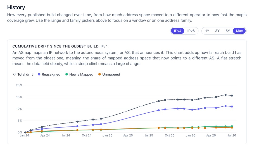
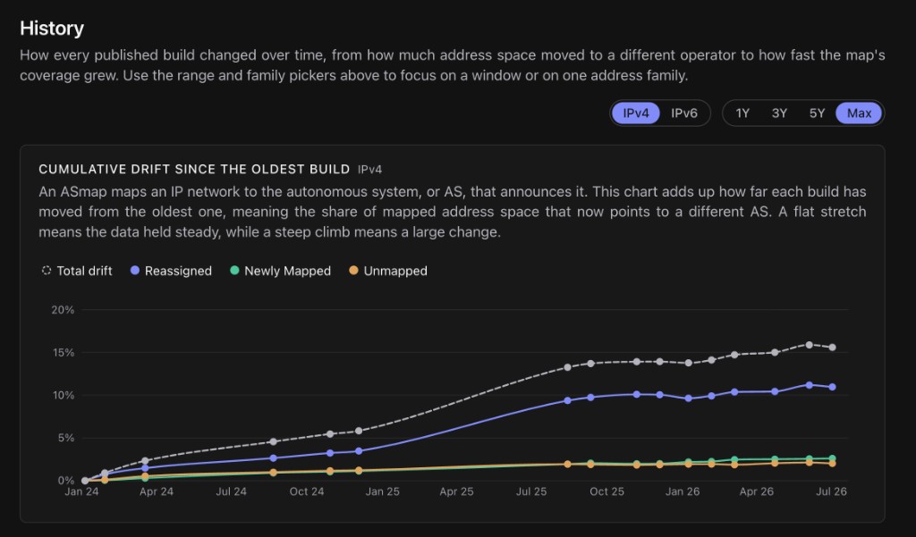
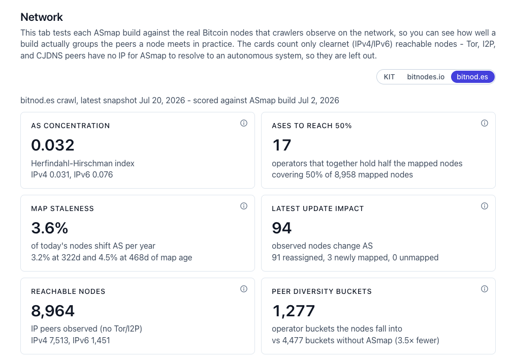
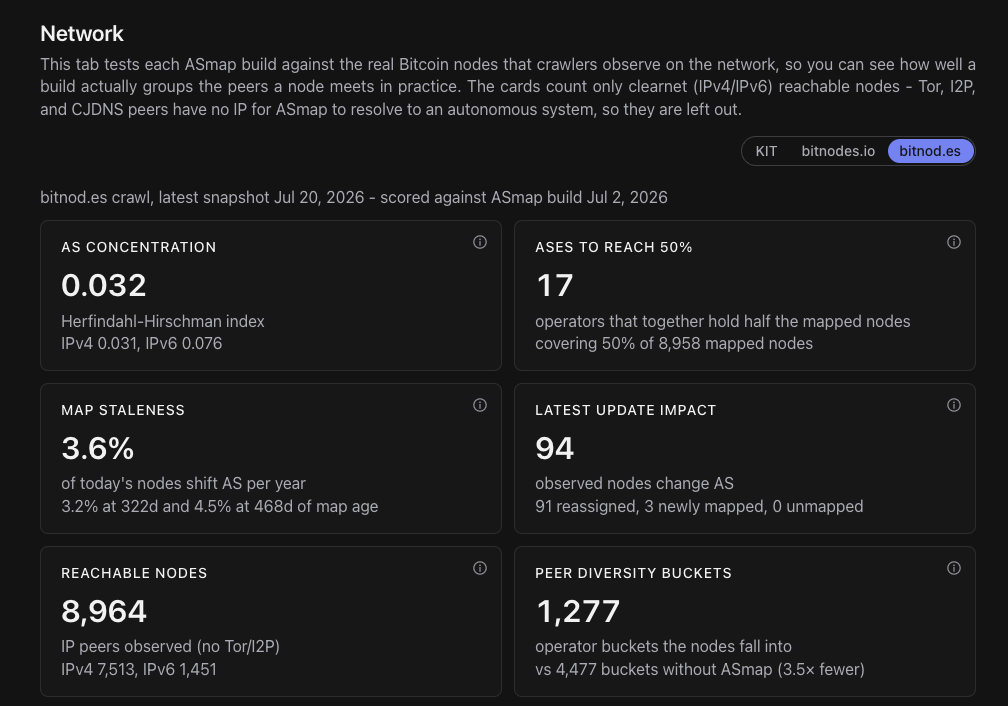
The second job is comparing those maps against the observed network. A map can be internally consistent and still describe an internet that no Bitcoin node lives in, so the dashboard takes node snapshots from real crawls and asks how well each build places them. The ongoing node data comes from the daily bitnod.es exports published by BitMEX Research. The series combines archived bitnodes.io snapshots with the new daily ones from bitnod.es.1 From each snapshot it computes concentration and placement metrics: how likely two random nodes are to sit in the same AS, how many operators together host half the network, how many peer-diversity buckets the nodes collapse into once a map is loaded, and how wrong an aging map would be for today's peers.
Removed
Added
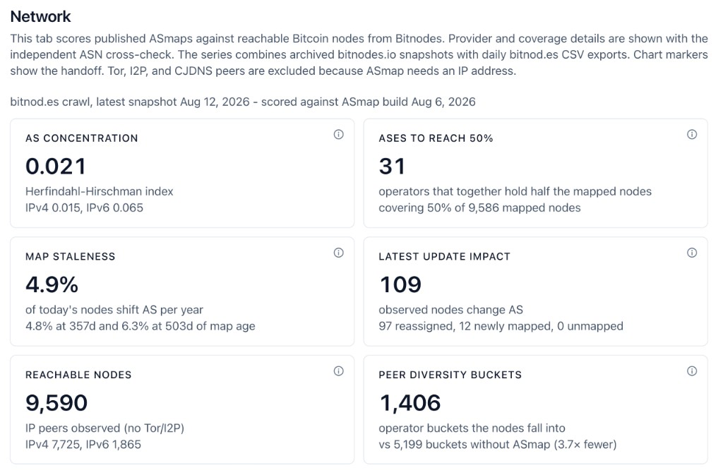
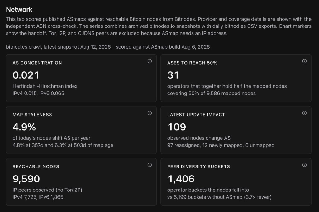
One of those numbers answers the aging question from the top directly: right now about 3.6%4.8% of today's nodes would be filed under the wrong AS by a one-year-old map. That figure comes from scoring old builds against current crawls.
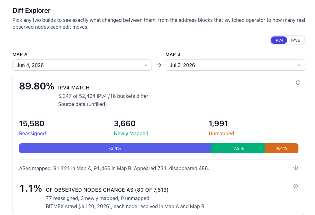
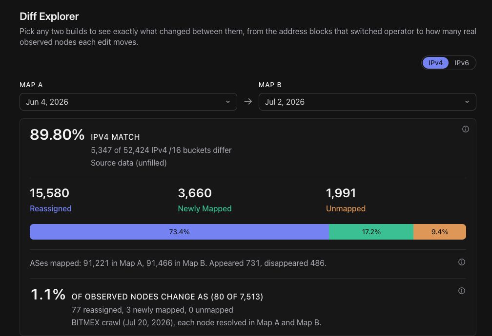
Between the two jobs sits a Diff Explorer. It compares any two builds, classifies every changed prefix, and then translates the prefix churn into the number that matters: how many actually observed nodes end up in a different AS.
Next If a number on the dashboard looks wrong from where you sit, I want to hear about it! The fastest way is an issue on the repo. Metric definitions and caveats are also there in docs/metrics.md for more information.
In roughly the order I plan to do them, over the remaining weeks of Summer of Bitcoin:
- Tor, I2P, and CJDNS are omitted. ASmap needs an IP address.
Harden the bitnod.es path with per-node ASN from WHOIS, so the decay curve stands on public data aloneMake fresh snapshots visible near real time instead of on the daily cronWrite the metric documentation: what each number means, its limits, and how to reproduce it locallyA geo view (per-country concentration) once the WHOIS path is stableDeploy under an asmap.org subdomain
If a number on the dashboard looks wrong from where you sit, I want to hear about it: the fastest way is an issue on the repo.
ASMap Dashboard
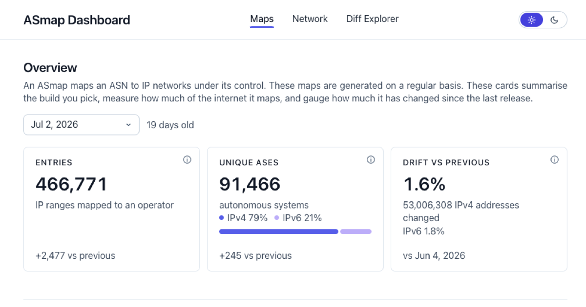
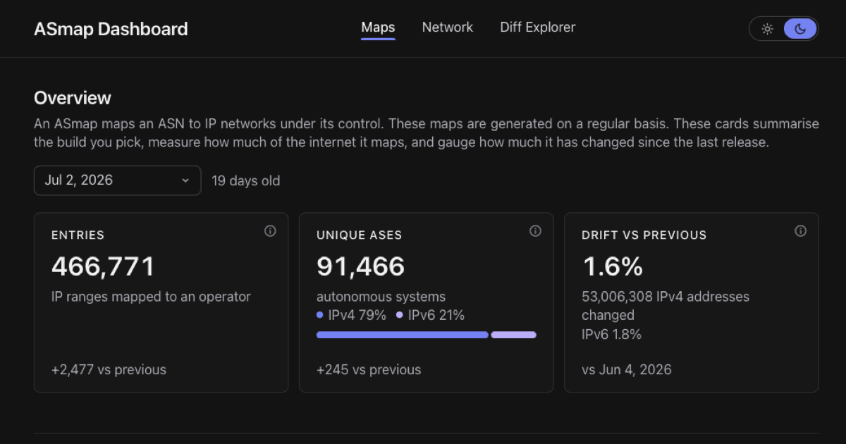
The ASMap Dashboard is a visual history of every ASmap build published in bitcoin-core/asmap-data, scored against the live Bitcoin network. It is my Summer of Bitcoin 2026 project, mentored by fjahr, with jurraca co-mentoring. The site is live under dashboard.asmap.org, discussion threads are on bnoc and Delving Bitcoin.
Some background. A Bitcoin Core node keeps only a small number of outbound connections. An attacker who fills all of those slots with machines they control can feed the node a false view of the chain, hide transactions from it, or cut it off entirely. That is an eclipse attack. The defense is to connect to peers in different parts of the internet, so no single party can occupy every slot. Grouping peers by IP prefix does this badly, because a cloud host like AWS owns thousands of prefixes and would still look like thousands of independent peers. ASmap groups every address by the autonomous system that announces it instead, so one operator counts as one group no matter how many addresses it holds. The feature has been in Bitcoin Core since 20.0. Since 31.0 every release ships with a map embedded, but the option remains off by default and you have to set -asmap or -asmap=1 to activate this feature.
Each map is a snapshot of internet routing, and routing moves. That leaves two questions that stayed open for years: when has an embedded map aged enough to become a liability, and how do you tell whether a freshly built map is an improvement or a regression before it ships? Both need a continuous measurement of how the maps fit the actual network. That measurement did not exist, so this project builds it.
What it does
The dashboard has two jobs, and everything on it belongs to one of them. The project is under active development and the layout changes as feedback comes in. The jobs underneath are stable.
The first job is evaluating the map history itself. The asmap-data repo has published builds since January 2024, each one produced by kartograf from public routing data and verified in coordinated launches (I wrote up how those work in a separate post).
The second job is comparing those maps against the observed network. A map can be internally consistent and still describe an internet that no Bitcoin node lives in, so the dashboard takes node snapshots from real crawls and asks how well each build places them. The series combines archived bitnodes.io snapshots with the new daily ones from bitnod.es.1 From each snapshot it computes concentration and placement metrics: how likely two random nodes are to sit in the same AS, how many operators together host half the network, how many peer-diversity buckets the nodes collapse into once a map is loaded, and how wrong an aging map would be for today’s peers.
One of those numbers answers the aging question from the top directly: right now about 4.8% of today’s nodes would be filed under the wrong AS by a one-year-old map. That figure comes from scoring old builds against current crawls.
Between the two jobs sits a Diff Explorer. It compares any two builds, classifies every changed prefix, and then translates the prefix churn into the number that matters: how many actually observed nodes end up in a different AS.
If a number on the dashboard looks wrong from where you sit, I want to hear about it! The fastest way is an issue on the repo. Metric definitions and caveats are also there in docs/metrics.md for more information.
Footnotes
-
Tor, I2P, and CJDNS are omitted. ASmap needs an IP address. ↩